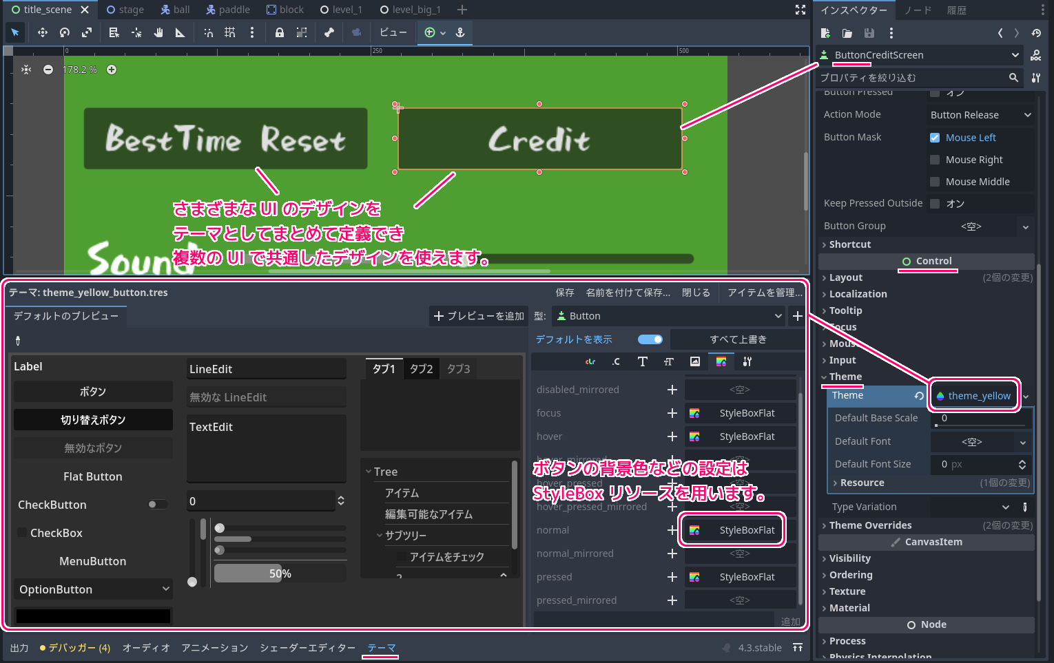
無料・軽快な 2D / 3D 用のゲームエンジン Godot Engine 4 で、ボタンやラベルなどの UI の色やフォントなどのデザインを設定して、複数の UI でそのデザインを共有できる Theme (テーマ) リソースと各項目で割り当てる StyleBox について紹介します。
GodotEngine4.3 時点では、ボタンの背景色など、テーマを使わないと指定できない要素もあります。
※ GodotEngine 4.3 を使用しています。.NET 版ではありません。
おおまかなイメージ
これから紹介する Theme (テーマ) リソースは、ボタンなどの Control 派生クラスの Theme プロパティで設定でき、そのテーマリソースで定義したデザインの UI を簡単に複数のボタンなどで共有して設定できます。
そして、その UI の通常時やマウスオーバー時の背景色やフォントを個別に設定するさらに細かなリソースが StyleBox リソースです。

テーマリソースとは
テーマリソースは、 UI の基本ノードである Control クラスの theme プロパティに設定することで、ボタンなどのさまざまな UI 群のフォントや色などのデザインをテーマ別に設定できます。
テーマリソースを使うことで、同じデザインにしたいボタンなどの UI を、テーマリソースを指定するだけで共有できます。
一部の設定は、各 GUI ノードの Theme Overrides で指定できますが、 GodotEngine4.3 ではボタンの背景色を設定するにはテーマリソースを用いる必要があります。
A resource used for styling/skinning Control and Window nodes. While individual controls can be styled using their local theme overrides (see Control.add_theme_color_override), theme resources allow you to store and apply the same settings across all controls sharing the same type (e.g. style all Buttons the same). One theme resource can be used for the entire project, but you can also set a separate theme resource to a branch of control nodes. A theme resource assigned to a control applies to the control itself, as well as all of its direct and indirect children (as long as a chain of controls is uninterrupted).
Use ProjectSettings.gui/theme/custom to set up a project-scope theme that will be available to every control in your project.
Use Control.theme of any control node to set up a theme that will be available to that control and all of its direct and indirect children.
コントロール ノードとウィンドウ ノードのスタイル/スキニングに使用されるリソース。個々のコントロールはローカル テーマ オーバーライドを使用してスタイル設定できますが (Control.add_theme_color_override を参照)、テーマ リソースを使用すると、同じタイプを共有するすべてのコントロールに同じ設定を保存して適用できます (例: すべてのボタンを同じスタイルに設定する)。 1 つのテーマ リソースをプロジェクト全体に使用できますが、別のテーマ リソースを制御ノードのブランチに設定することもできます。コントロールに割り当てられたテーマ リソースは、コントロール自体だけでなく、その直接および間接的なすべての子にも適用されます (コントロールのチェーンが中断されない限り)。

ProjectSettings.gui/theme/custom を使用して、プロジェクト内のすべてのコントロールで使用できるプロジェクト スコープのテーマを設定します。

任意のコントロール ノードの Control.theme を使用して、そのコントロールとその直接および間接のすべての子で使用できるテーマを設定します。
Theme — Godot Engine (4.x)の日本語のドキュメント と Google 翻訳
項目に割り当てる StyleBox リソースの種類
StyleBox は、UI の個別の色や形などを定義するための抽象基本クラスです。
実際には、StyleBox から派生したリソースを用います。
StyleBox is an abstract base class for drawing stylized boxes for UI elements. It is used for panels, buttons, LineEdit backgrounds, Tree backgrounds, etc. and also for testing a transparency mask for pointer signals. If mask test fails on a StyleBox assigned as mask to a control, clicks and motion signals will go through it to the one below.
Note: For control nodes that have Theme Properties, the
focusStyleBox is displayed over thenormal,hoverorpressedStyleBox. This makes thefocusStyleBox more reusable across different nodes.StyleBox は、UI 要素の様式化されたボックスを描画するための抽象基本クラスです。これは、パネル、ボタン、LineEdit の背景、ツリーの背景などに使用され、またポインター信号の透明マスクをテストするためにも使用されます。コントロールにマスクとして割り当てられた StyleBox でマスク テストが失敗した場合、クリックとモーション信号はその下を通過します。 注: テーマ プロパティを持つコントロール ノードの場合、フォーカス StyleBox は通常の StyleBox、ホバー、または押された StyleBox の上に表示されます。これにより、フォーカス StyleBox がさまざまなノード間で再利用可能になります。StyleBox — Godot Engine (4.x)の日本語のドキュメントと Google 翻訳
StyleBoxEmpty
StyleBoxEmpty は、何もスタイルを設定していないことを表すために選択します。
An empty StyleBox that can be used to display nothing instead of the default style (e.g. it can “disable”
focusstyles).デフォルトのスタイルの代わりに何も表示しないために使用できる空の StyleBox (たとえば、フォーカス スタイルを「無効にする」ことができます)。StyleBoxEmpty — Godot Engine (4.x)の日本語のドキュメントと Google 翻訳
StyleBoxFlat
StyleBoxFlat リソースは、後述する StyleBoxTexture とは異なりテクスチャ画像を使わずに、色やフォントでボタンなどの UI をデザインします。
By configuring various properties of this style box, you can achieve many common looks without the need of a texture. This includes optionally rounded borders, antialiasing, shadows, and skew.
Setting corner radius to high values is allowed. As soon as corners overlap, the stylebox will switch to a relative system.
このスタイル ボックスのさまざまなプロパティを構成すると、テクスチャを必要とせずに多くの一般的な外観を実現できます。これには、オプションで丸い境界線、アンチエイリアス、シャドウ、およびスキューが含まれます。

コーナー半径を大きな値に設定することは可能です。角が重なるとすぐに、スタイルボックスは相対システムに切り替わります。
StyleBoxFlat — Godot Engine (4.x)の日本語のドキュメントと Google 翻訳
StyleBoxLine
StyleBoxLine は、線の色や太さを定義します。
A StyleBox that displays a single line of a given color and thickness. The line can be either horizontal or vertical. Useful for separators.
指定された色と太さの単一の線を表示する StyleBox。線は水平または垂直のいずれかにすることができます。区切り文字に便利です。StyleBoxLine — Godot Engine (4.x)の日本語のドキュメントと Google 翻訳
StyleBoxTexture
StyleBoxTexture はテクスチャ画像をボタンなどに指定できます。
また、画像を拡大縮小する際に9分割のエリアの範囲を指定できる9パッチも設定できます。
A texture-based nine-patch StyleBox, in a way similar to NinePatchRect. This stylebox performs a 3×3 scaling of a texture, where only the center cell is fully stretched. This makes it possible to design bordered styles regardless of the stylebox’s size.
NinePatchRect と同様の、テクスチャベースの 9 パッチ StyleBox。このスタイルボックスは、テクスチャの 3×3 スケーリングを実行し、中央のセルのみが完全に引き伸ばされます。これにより、スタイルボックスのサイズに関係なく、ボーダー付きスタイルをデザインできるようになります。StyleBoxTexture — Godot Engine (4.x)の日本語のドキュメントと Google 翻訳
まとめ
無料・軽快な 2D / 3D 用のゲームエンジン Godot Engine 4 で、ボタンやラベルなどの UI の色やフォントなどのデザインを設定して、複数の UI でそのデザインを共有できる Theme (テーマ) リソースと各項目で割り当てる StyleBox について紹介しました。
GodotEngine4.3 時点では、ボタンの背景色など、テーマを使わないと指定できない要素もあります。
参照サイト Thank You!
- Godot Engine – Free and open source 2D and 3D game engine
- Xユーザーのビッグカツといか姿フライのすぐる【公式】さん: 「使いどころは思いつきませんが、フリー素材としてどうぞご自由にお使いくださいませ! https://t.co/8F9q3hS02b」 / X
- しょかきうたげ【フリーフォント版あり】 – ぼんのう堂 – BOOTH
- Label — Godot Engine (4.x)の日本語のドキュメント
- Button — Godot Engine (stable) documentation in English
- Theme — Godot Engine (4.x)の日本語のドキュメント
- StyleBox — Godot Engine (4.x)の日本語のドキュメント
- StyleBoxEmpty — Godot Engine (4.x)の日本語のドキュメント
- StyleBoxFlat — Godot Engine (4.x)の日本語のドキュメント
- StyleBoxLine — Godot Engine (4.x)の日本語のドキュメント
- StyleBoxTexture — Godot Engine (4.x)の日本語のドキュメント
記事一覧 → Compota-Soft-Press

コメント